Showing posts with label brusho. Show all posts

Wednesday, January 6, 2016

Blue Semaphore

I will be back home in sunny Florida before you know it.
Being too hot and wishing I was back in Maine.
Seriously.
In the meantime, let me introduce you to semaphore.
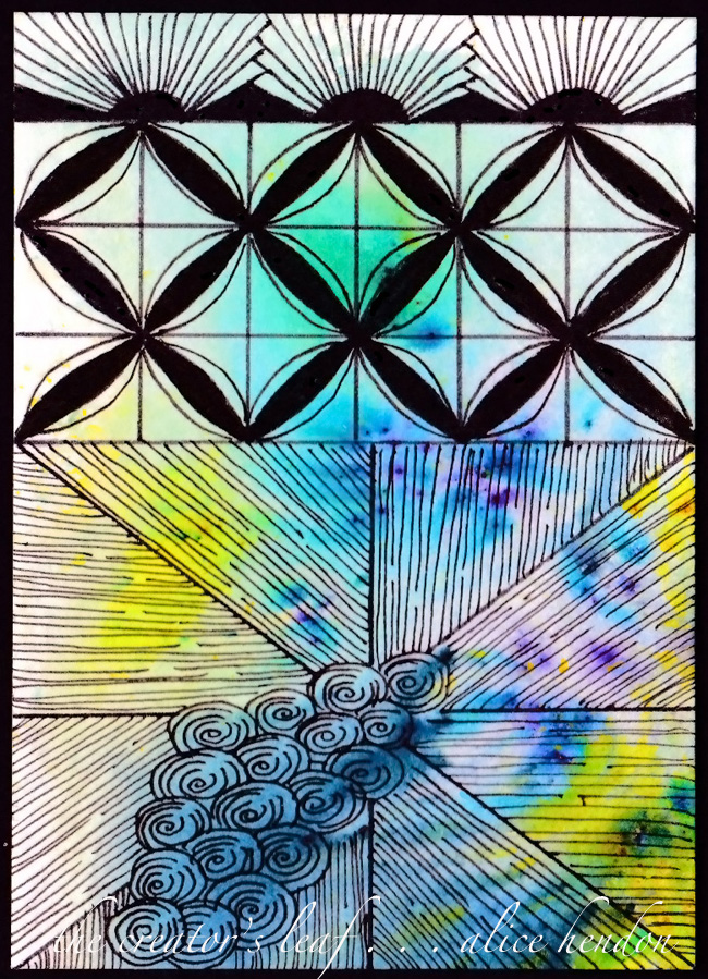
That grid tangle down through the middle.
Doesn't it remind you of the signal flags used on ships?
The art of signal flagging is called
semaphore.
Hence, the name.
To the left you have dropz, another of my patterns, 
and the fringe is an abbreviated version of airways.

I had a lot of fun putting these ATCs together,
and you have almost seen them all. 
The Creator's Leaf

Saturday, January 2, 2016

Cee-a-mosa

This ATC was serious fun. 
I keep working with auras, and this one just kind of
came together when I wasn't paying attention.
I will be posting a step out soon.
I am calling this tangle
cee-a-mosa. 
And it's a secret why I'm naming it that!
Hahaha!
Brusho background. Such fun colors!

The Creator's Leaf

Tuesday, December 29, 2015

Diagonal²

Today in Maine it is supposed to be a high
of 14 degrees, with a low of 9.
Snow is imminent, if not already happening.
If you follow my Facebook page,
know that there will definitely be snow shots
showing up there and on instagram.
For sure. Hahaha!

This ATC was colored with brusho color crystals,
I love those!  They work so well!
That grid pattern is called Diagonal².
I put this tangle together for a showcase
on Facebook. I will release a step out for it soon.


The Creator's Leaf

Saturday, December 26, 2015

Working On Some ATCs

By this point all the Christmas gifts have been opened,
all the cookies and cakes and pies have been devoured,
Grandma and Grandpa have headed back home,
and all the new toys have been played with
and left laying around the living room floor.

I hope you had a wonderful holiday spent with someone you love.
I am going to prep a few blog posts and schedule
them to post over the next couple weeks.
They will feature a set of ATCs I've been working on
for an upcoming swap.
This particular one takes a new tangle called
 Beauchamp by Julie Beland,
and mingles it with Baubles - a new one of mine that
debuts in the Tangle It! Planner.
The colorful background is Brushos Color Crystals.

Enjoy the rest of your holiday!
The Creator's Leaf

Sunday, November 15, 2015

Curlz - A New Tangle Pattern

 Over the past month or so, 
you may have seen this fun little tangle popping up in my artwork.
So much fun and easy to draw,
I would like to introduce you to curlz!
 Curlz is easy once you get that round, swooping line under control. 
It took me awhile, my hand isn't the steadiest,
just keep trying - it will get easier as you go.
If you work in single units, just be sure to close those tails
and to start the next curl underneath the one before it.
Of course, I prefer curlz in a line and attached.
Just a rolling swoop of curlz!
 Before you ask - the color behind Mr. Duck is Brushos Color Crystals. 
Dripped into a super wet sheet of watercolor paper.
Curlz has a lot of applications.
I want to show you just a few here,
then you can take curlz and make it your own.
So, curlz can be water.
(White caps on the ocean, clouds in the sky,
curlz would also make a great sun!)
 Curlz can be a connector, joining tangled sections.
It doesn't have to have those horizontal lines.
 I add the lines because I like the Seussical feel it gives to the piece of art.
Here you see curlz makes a great border/frame!
(This color came from Dylusions Ink Sprays!)
 I wanted to see if curlz could be turned into a flower.
Yes. It can.
 This one really reminds of Seuss drawings.
(Apparently curlz would make a great octopus, too!)
Here you see the whole coloring sheet I created,
and you can see those two bits of curlz
in their natural setting. 
You see there are many applications for curlz.
And this is just the tip of the iceberg.
So to speak.
Please take curlz and give it a whirl.
I would love to see what you do with it!
The Creator's Leaf

Tuesday, August 25, 2015

Narwal and Bublz

What a fun piece to make!
The color comes from Brushos Crystals,
you literally sprinkle them onto wet paper
and watch them work.
No science, no thought process,
just water wash the paper and sprinkle.

After the beautiful color is completely dry,
tangle with your favorite pen.
My current pen of preference is the Sharpie Fine Point.

Tangles in this beauty include:
bubble wrap,
bublz,
dandelion,
O'Cee, and
narwal.

If you would like to see a great video showing you how to draw narwal, 
check out Helen Williams' video at this link.
This video really defined to me the way narwal should be tangled.
Have fun!


The Creator's Leaf

Friday, July 10, 2015

Feather Stacking

 You keep hearing me talk about stacking tangles.
Right now I am working on feather stacks.
You see, each of those little v-shaped sections
is a separate stack.
Let me walk you through how I made this.
I love me some bright, beautiful, vibrant color!
To get this color effect I wanted, I used some Brushos Crystal Colours.
Brushos are powders that activate and swirl and mix when hit with water.
I began by using a mop brush and just slopping water all over the top 
of my 140 lb. mixed media paper.
Then I used three shades of Brushos crystals and just 
tapped the color into the water.
After the color spread and mixed, I realized it still needed a bit more green, 
so I added more of the pigment where I thought it would work best. 
If you are interested in reading more about Brushos,
I did an in-depth product review here
Once my paper was completely dry,
I lay in a faint outline of a feather and filled in the vein.
I haven't done a successful feather before,
so I thought the pencil line might help me with parameters.
I began by dividing some sections and etching in  feathered lines for segments.
Then I tangled the areas. 
I wasn't really happy with the way my feather looked at this point.
So I added some frills. 
A little fescu, some more whispy lines,
and that white gel pen for some popping highlights.

I think I like this feather stacking.
Definitely going to give it another try.
Hahaha! Why don't you join me?


Wednesday, July 1, 2015

A Little Brusho Under the Sea

I love my brushos!
They give great, vivid color every time.
This was a 5" x 7" scrap with some brushos left
over from another project.
Don't ever throw out your scraps!
I just tangled up a little undersea adventure and fun!
I loved the way this turned out!

Monday, January 26, 2015

Brusho Crystal Colors - Product Review

A couple days ago I blogged about making this awesome tree.
I had a lot of people contact me through email,
through facebook, instagram, and pinterest,
to ask me about Brusho Crystal Colors.
To those that asked - here you go!
Brusho Crystal Colors product review.
Never heard of Brushos?
I found out about them on pinterest.
Everything you ever needed to know can be found on 
Pinterest!
 The Brusho® website describes them as:

brilliantly intense paint powder that comes in little pots of magic!

Hahaha! So true!
Little plastic pots filled with crystals of beautiful, lush color.
My starter set came with 12 pots of color.
I began by making a color chart.
Brushos are activated when they hit water. 
Literally all I did to make this chart was to put a drop of water on my paper using a mop brush,
then I shook/tapped some of the crystals into the wet drop, and waited.

The brusho crystals are a fine powder. The little spots you see in random places on my paper are the fine little bits of color that didn't reach the water.
And I was a little stingy on the color,
these could have been brighter and more intense,
as you will see as you read through this post.
The first project I made was this tree.
I used three techniques.

For the tree trunk, I used a paint palette and mixed some dark brown crystals with a wet paint brush. Then I just painted on the trunk and some random limbs.

For the top part of the tree,
I used a mop brush and spread a layer of water
across the area where I wanted there to be leaves.
Then I used purple, lemon, and emerald green crystals - by simply tapping the color straight into the water I had spread on the paper, allowing them to  spread and mix. 
Easy peasy. I promise.

I did the same thing under the tree:
wet the area, sprinkled some color,
then used a wet paintbrush to mix the colors
and spread them a bit.

You can dry this with a heat gun if you wish,
but my understanding is the heat may mute the color.
So I left it to dry while we ate dinner.
 For the next project, I used a sheet of Bristol Smooth Mixed Media paper.
(I will do a detailed post later showing the steps in this project.)
Basically what I did was use a mop brush and plenty of water 
to draw the larger flowers on the paper.
The Brusho crystals were sprinkled into each area and left to mix.
In some areas I used more than one color.
In a few spots I used a small paint brush to push color where I wanted it to go.
The leaves were added the same way the tree trunk was added in the first project.

Once this was completely dry, I added tangling with a Sharpie fine point.
I did not have any trouble drawing on the Brusho at all.
The Brusho dried flat and smooth, and 
accepted the penwork with no problems.
No skips, no pulls on the nib, no dragging lines.
Smooth as could be!
The Brusho colors were consistently bright,
intense and beautiful. I really love the way the purple shows several different colors.
The black does the same, I just haven't used it in a project yet.
Here is the completed drawing.
This paper is 9" x 12", and the colors
really are this bright and beautiful in person!
Super simple to make.
Here is a smaller piece, made on smooth watercolor paper.
I made closely spaced blobs of water with a paint brush,
then sprinkled the color into the water drops.
I used a small paint brush to fill in the areas,
and make it look like the flowers were overlapping.

I did have a bit of an issue when I got one wet color
too close to another wet color.
They wanted to bleed into each other.
I found that a paper towel to blot up the excess
and create a barrier between the colors worked very well.

To make the background, I mixed water and crystals in a paint palette. I made a well of lemon, one of lime green, and one of yellow.
I used lots of water to create washes,
which I spread onto the paper with a wide, flat brush.
(Sorry, I'm not all that familiar with the brush names.)
This piece came together really well once I figured out how to deal with the bleedover in the wet colors.
Up to this point I used paper made for water.
I wanted to experiment on some of the other
papers that I routinely draw on.
Here I used a Zentangle® Bijou® twinchie.
A little two inch bit of paper. 

I made this a little backwards from the first projects.
I sprinkled color onto the dry paper, 
using purple, turquoise (love this color!), and lemon.
(I prefer the lemon over the yellow. I would have thought they would be similar, but the yellow has a lot of orange in it. I am not a fan of orange.)
Once I felt I had enough crystals on the tile,
I hit it with one spritz of water from my spray bottle.
Then I left it to sit,
this is how it turned out. Awesome!
Paper didn't curl, it stayed flat, and dried nice and smooth.
I was happy with the way the twinchie performed,
so I moved on to Zentangle® ATCs.
I began by tangling with a Sharpie Fine Point.
Then I liberally sprayed them all with water
(and said a thank you prayer that the pen didn't smear.)
I sprinkled a color on each ATC. 

Up to this point I had let the color stay as brilliant as it developed. 
I wondered what would happen if I blotted up a good bit of the color.
So as I sprayed and colored these, I completely blotted them - removing a decent amount of color. Then I added more color, sometimes a second color, and blotted again. This is how they turned out. A little muted, but still quite beautiful.
Moving on, I took a large sheet of mixed media paper  and a mop brush and slopped tons of water all across the page.
I mean lots of water!
Then I sprinkled on all the colors I like best -
leaf green, purple, ultramarine, and turquoise.

I tilted the page and spread color all across the surface,
then covered the whole thing with a piece of kitchen plastic wrap.
When you use the plastic wrap, feel free to push it gently with your fingertips so it causes these little creases.
I left the paper intact with the plastic wrap right where it sat,
and let it dry overnight.

The next morning, the first thing I noticed was the plastic wrap had moved and flattened out on the paper.
The little texture creases weren't there anymore.
I was really disappointed.
Until I removed the wrap.
Even though the creases didn't show in the wrap,
they still showed on the paper.
This is how it looked dry.
And quite frankly - I love it!
Reminds me of rich, beautiful batiks!
I took the same steps with this one,
except before placing the plastic wrap down - 
I dropped a lot of sea salt into the wet puddles.
Then I added the wrap, scrunched it up into texture creases,
and left it to dry overnight.
This is my favorite piece so far!
I removed the plastic wrap, smoothed off the remaining salt crystals with the flat edge of an old Disney World hotel room key (think credit card),
and this is how it turned out!

This was a 9" x 12" sheet of Bristol smooth.
The colors are wonderful and the texture worked better with the salt!
I am really happy with the way the Brushos have reacted 
in the several projects I did.
The colors are bright and intense
(you know how I am about my color!),
they lay down smooth and flat,
and they are a dream to draw on.
The papers I chose to use worked well,
there was no pilling,
and very minimum warping.
I like the results so much in fact -
that I went online and ordered the other
twelve colors they come in so I will have them all!

Next project?
Brushos meet the gelli plate.
Stay tuned.

Friday, January 23, 2015

Stepping Outside My Comfort Zone

Here we are at week 4 of our 
art journaling journey for 2015.
I never thought I would make it to week four
and still be interested and involved.
So many other times I am have participated in
online classes, online projects - just to find
a couple weeks in that I was bored to death.
That isn't happening here.
Thank you, Cherryl Moote, for putting this together!

With that being said, week four's prompt was to
step outside our comfort zone and try something
we had been wanting to try
but
might have been too unsure - AKA scared - to give it a go.
I had several ideas running rampant through my brain.
Hahahaha! You know how I am!
I figure I may get a good 4-5 pages done this week.
And they may all look awful, 
but that's okay, cause I have been given
permission
to step outside the zone.

So for today, I pulled out my little box of awesomeness
that is called
Brusho Crystal Colors.
The Brusho® website describes them as:

brilliantly intense paint powder that comes in little pots of magic!

Hahaha! So true!
They are little jars filled with crystals of beautiful, lush color.
My started kit came with 12 pots of color.
I started by making a color chart.
Literally all I did was make a drop of water from a mop brush, and shaked (shook???) a little color into the wet drop and waited.
The brusho is a fine powder.
Those little spots you see here and there on the paper are fine little bits of color that didn't make it to the water.
And I think I was a little stingy on the color,
these could have been much brighter and intense.
I played with the color on a couple zentangle® tiles
to start with.
Those are going to mail out in an ATC swap fairly soon.
For this week's journal project,
I used this paper for the first time.
I wanted to keep the paper a little lighter weight,
because I already knew I wasn't doing this project 
directly in my journal, but building it elsewhere
and glueing it in place.
I'm willing to step outside my comfort zone -
to a degree. Haha!
(On the other hand, I wouldn't recommend this paper for a project with a lot of water. Warping was an issue, but nothing a bunch of heavy books couldn't handle.)
And this is what I did.
I found a YouTube video that walked me through it.
I loosely sketched out a tree trunk with a pencil.
With a wet brush I picked up some brown crystals and filled in a trunk.
Then I sprayed water around the top of the tree,
and sprinkled three different colors of
Brusho crystals into the water
and let it sit and mix.
I had one spot where there was too much water -
who knew, right? -
so I blotted that with a paper towel,
lifting what I didn't need.
Then I let the whole thing dry.
Ta-dah!
The last 'rule' for this week was this -
after we stepped out of our comfort zone and tried something new,
then we were supposed to go back and use some of
our favorite tangles,
our mac and cheese tangles,
to complete our project.
Well, I love how my first little tree turned out.
I didn't want to mess it up.
So, being the rebel I am, my thoughts went straight to
The Pirates of the Caribbean.
where Captain Hector Barbossa said
the Code (of the Pirate Brethren) is
more what you call guidelines, than actual rules.
So. I added that quote and called it done.
Hahahaha!

And because I had this blank page next to my week two page -
which also sported some trees - I thought it to be a perfect fit.
Last, I adhered the new page in place with some score tape.

Week Four √