A couple days ago I blogged about making this awesome tree.
I had a lot of people contact me through email,
through facebook, instagram, and pinterest,
to ask me about Brusho Crystal Colors.
To those that asked - here you go!
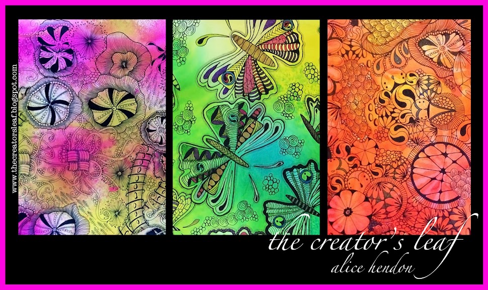
Brusho Crystal Colors product review.
Never heard of Brushos?
I found out about them on pinterest.
Everything you ever needed to know can be found on
Pinterest!
The Brusho® website describes them as:
brilliantly intense paint powder that comes in little pots of magic!
Hahaha! So true!
Little plastic pots filled with crystals of beautiful, lush color.
My starter set came with 12 pots of color.
I began by making a color chart.
Brushos are activated when they hit water.
Literally all I did to make this chart was to put a drop of water on my paper using a mop brush,
then I shook/tapped some of the crystals into the wet drop, and waited.
The brusho crystals are a fine powder. The little spots you see in random places on my paper are the fine little bits of color that didn't reach the water.
And I was a little stingy on the color,
these could have been brighter and more intense,
as you will see as you read through this post.
The first project I made was this tree.
I used three techniques.
For the tree trunk, I used a paint palette and mixed some dark brown crystals with a wet paint brush. Then I just painted on the trunk and some random limbs.
For the top part of the tree,
I used a mop brush and spread a layer of water
across the area where I wanted there to be leaves.
Then I used purple, lemon, and emerald green crystals - by simply tapping the color straight into the water I had spread on the paper, allowing them to spread and mix.
Easy peasy. I promise.
I did the same thing under the tree:
wet the area, sprinkled some color,
then used a wet paintbrush to mix the colors
and spread them a bit.
You can dry this with a heat gun if you wish,
but my understanding is the heat may mute the color.
So I left it to dry while we ate dinner.
For the next project, I used a sheet of Bristol Smooth Mixed Media paper.
(I will do a detailed post later showing the steps in this project.)
Basically what I did was use a mop brush and plenty of water
to draw the larger flowers on the paper.
The Brusho crystals were sprinkled into each area and left to mix.
In some areas I used more than one color.
In a few spots I used a small paint brush to push color where I wanted it to go.
The leaves were added the same way the tree trunk was added in the first project.
Once this was completely dry, I added tangling with a Sharpie fine point.
I did not have any trouble drawing on the Brusho at all.
The Brusho dried flat and smooth, and
accepted the penwork with no problems.
No skips, no pulls on the nib, no dragging lines.
Smooth as could be!
The Brusho colors were consistently bright,
intense and beautiful. I really love the way the purple shows several different colors.
The black does the same, I just haven't used it in a project yet.
Here is the completed drawing.
This paper is 9" x 12", and the colors
really are this bright and beautiful in person!
Super simple to make.
Here is a smaller piece, made on smooth watercolor paper.
I made closely spaced blobs of water with a paint brush,
then sprinkled the color into the water drops.
I used a small paint brush to fill in the areas,
and make it look like the flowers were overlapping.
I did have a bit of an issue when I got one wet color
too close to another wet color.
They wanted to bleed into each other.
I found that a paper towel to blot up the excess
and create a barrier between the colors worked very well.
To make the background, I mixed water and crystals in a paint palette. I made a well of lemon, one of lime green, and one of yellow.
I used lots of water to create washes,
which I spread onto the paper with a wide, flat brush.
(Sorry, I'm not all that familiar with the brush names.)
This piece came together really well once I figured out how to deal with the bleedover in the wet colors.
Up to this point I used paper made for water.
I wanted to experiment on some of the other
papers that I routinely draw on.
Here I used a Zentangle® Bijou® twinchie.
A little two inch bit of paper.
I made this a little backwards from the first projects.
I sprinkled color onto the dry paper,
using purple, turquoise (love this color!), and lemon.
(I prefer the lemon over the yellow. I would have thought they would be similar, but the yellow has a lot of orange in it. I am not a fan of orange.)
Once I felt I had enough crystals on the tile,
I hit it with one spritz of water from my spray bottle.
Then I left it to sit,
this is how it turned out. Awesome!
Paper didn't curl, it stayed flat, and dried nice and smooth.
I was happy with the way the twinchie performed,
so I moved on to Zentangle® ATCs.
I began by tangling with a Sharpie Fine Point.
Then I liberally sprayed them all with water
(and said a thank you prayer that the pen didn't smear.)
I sprinkled a color on each ATC.
Up to this point I had let the color stay as brilliant as it developed.
I wondered what would happen if I blotted up a good bit of the color.
So as I sprayed and colored these, I completely blotted them - removing a decent amount of color. Then I added more color, sometimes a second color, and blotted again. This is how they turned out. A little muted, but still quite beautiful.
Moving on, I took a large sheet of mixed media paper and a mop brush and slopped tons of water all across the page.
I mean lots of water!
Then I sprinkled on all the colors I like best -
leaf green, purple, ultramarine, and turquoise.
I tilted the page and spread color all across the surface,
then covered the whole thing with a piece of kitchen plastic wrap.
When you use the plastic wrap, feel free to push it gently with your fingertips so it causes these little creases.
I left the paper intact with the plastic wrap right where it sat,
and let it dry overnight.
The next morning, the first thing I noticed was the plastic wrap had moved and flattened out on the paper.
The little texture creases weren't there anymore.
I was really disappointed.
Until I removed the wrap.
Even though the creases didn't show in the wrap,
they still showed on the paper.
This is how it looked dry.
And quite frankly - I love it!
Reminds me of rich, beautiful batiks!
I took the same steps with this one,
except before placing the plastic wrap down -
I dropped a lot of sea salt into the wet puddles.
Then I added the wrap, scrunched it up into texture creases,
and left it to dry overnight.
This is my favorite piece so far!
I removed the plastic wrap, smoothed off the remaining salt crystals with the flat edge of an old Disney World hotel room key (think credit card),
and this is how it turned out!
This was a 9" x 12" sheet of Bristol smooth.
The colors are wonderful and the texture worked better with the salt!
I am really happy with the way the Brushos have reacted
in the several projects I did.
The colors are bright and intense
(you know how I am about my color!),
they lay down smooth and flat,
and they are a dream to draw on.
The papers I chose to use worked well,
there was no pilling,
and very minimum warping.
I like the results so much in fact -
that I went online and ordered the other
twelve colors they come in so I will have them all!
Next project?
Brushos meet the gelli plate.
Stay tuned.


wow! What an amazing review. Your projects are all so beautiful! Thanks for sharing! I just bought a product called Bister and I'll be able to use these same techniques with it. I look forward to experimenting!
ReplyDeletethanks, charlene, now i'll need to go check out Bister :) hahaha! have fun experimenting with your brushos, i hope you love them as much as i do
DeleteAbsolutely awesome!!!!! Good job.....can't wait to see more!!!!
ReplyDeletethanks, charlotte! i love me some good bright, beautiful color!
DeleteThese are so cool...Looking forward to seeing more!
ReplyDeletethanks, genevieve, i am having so much fun! i really want to see if i can incorporate them into the gelli plate fun somehow. working on that today :)
DeleteAlice I really enjoyed this product review. The Brushos are awesome and your work is fabulous. I agree with you - love, love, love that color. I must learn to experiment more often. Thanks for sharing this......Linda E. P.S. I just thought of something - we're getting lots of snow right now in the Northeast. Can you imagine some of the Brushos sprinkled on some snow????? Hee, hee...
ReplyDeletefunny you mentioned learning to experiment. i've had these brushos sitting on a shelf for over a year. one of the facebook groups i participate in challenged us to art journal this week, stepping outside our comfort zone. one of the ways suggested was by using a product we had never used before. i added the words "and are intimidated by" hahaha! now i wish i'd pulled them out a year ago :) so. go have fun! step outside your comfort zone today :)
DeleteDo you like Brushos better than Dylusions?
ReplyDeleteNothing can beat the colors you get with dylusions, brushos would be a close second in my opinion
DeleteThis comment has been removed by a blog administrator.
ReplyDeleteWow! What beautiful colors and gorgeous art you've made! I love, love, LOVE color. Brushos is now on my very long wish list. I am in awe of you!
ReplyDeletethe brushos are so much fun to work with. and they are on sale on their website for half price through tomorrow :)
DeleteSuperbly helpful & I too love the salt & plastic wrap version the best. Thanks for doing this so thoroughly.
ReplyDeletePaula (PEP)
it was fun, paula. i played with the brushos and my gelli plate yesterday and they worked :)
DeleteA friend turned me on to Brushos, and I ordered a set of 24 yesterday. I want them LAST WEEK, but I will have to wait until they arrive. Your work is beautiful, and thank you for showing us and telling us what you did with each picture. I have used Dylusions and they really are very vibrant, so I am anxious to try these wonderful colours too.
ReplyDeleteGreat tutorial! Thank you for showing how you created the tree,wonderful info. I have just started experimenting with my Brushos and absolutely love the intensity of the colors. I like the randomness of sprinkling and spraying with them,never twice the same thing,every time you spray or sprinkle a new surprise!
ReplyDeleteI've had these in my Amazon "wishlist" for months. Your post has convinced me to make that wish come true. I'm ordering them TODAY!
ReplyDeleteThank you!
I've just received my pots as my Mother's Day present. Thanks very much for the ideas on how to use them and the pics showing the different effects. I'm away to play now.
ReplyDelete