There are some new kids on the block
and
they wanted to come out and play this week!
This play session started with some awesome
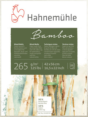
Bamboo Mixed Media paper from
The German paper company has been around since 1584!
On Hahnemühle's history page you will see the statement:
Paper Makes the Difference!
Truer words were never spoken.
I recently received this Bamboo product
from Hahnemühle to work with and review.
Let's start with a few words about the paper.
Due to its design, Bamboo allows the color to flow beautifully, yet maintain its brilliance.
Their website uses words like "high contrast" and "excellent color intensity" to describe this 125 pound mixed media wonder.
It has a variety of uses including watercolor, acrylic and pastel techniques, drawing and mixed media.
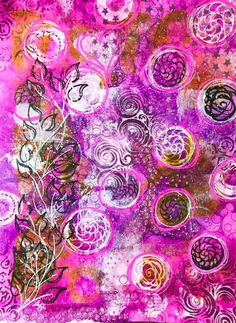
This Bamboo pad was crying for color so of course I had to oblige!
The paper is 90% Bamboo fibre and 10% cotton rag.
It came to me in a pad of 25 sheets - glued along the two outer edges.
The purpose of the glue is to hold your wet product flat until dry. No warping, no curling.
And that is a good thing because I like to work with lots of water!
And lots of ink!
For this particular piece I pulled out Ranger Industries' new
Just released at Creativation, I got several bottles from
to try because I love the other
Dylusions Spray Inks so much!
For this project I used just two -
Crushed Grape and Funky Fuchsia.
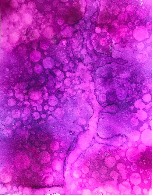
I began with a mop brush and a cup of water,
thoroughly soaking the paper.
Why not? Right?
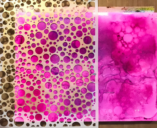
Then I sprayed on lots of the two colors
and let them run and blend into each other.
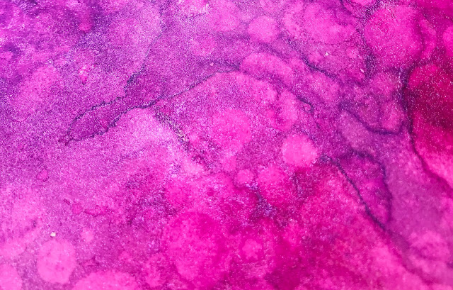
See where those runs and drips are?
That is where I used the heat gun to push the color
into lines to give contrast and places to tangle.
Once the piece was mostly dry,
I took the stencil you see and placed it on top of the color,
sprayed water across the top,
then rolled a paper towel over the surface to pick up the excess color.
When you add water over these inks - it removes the color because the inks are not color fast.
Which means you can move them around to your heart's content.
Then I used a heat gun to dry the paper well.
A palette knife allowed me to remove the page from the
Bamboo block of paper.
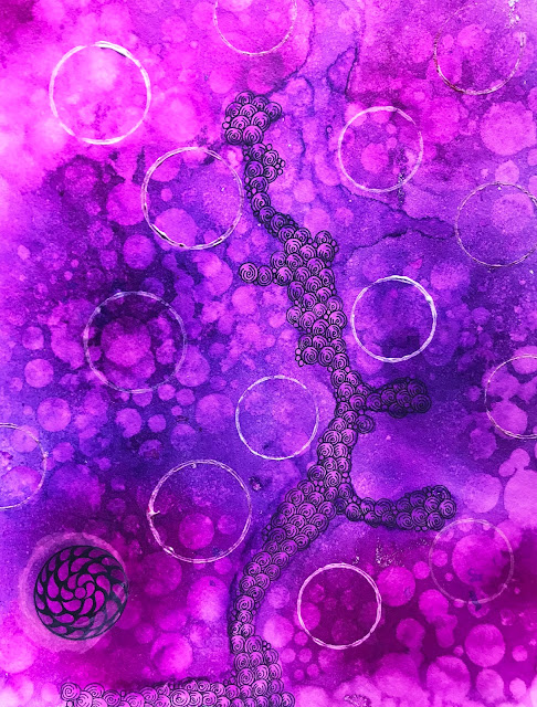
I started tangling - what else? - Printemps with my
Sarasa Fineliner from Zebra Pen,
but I felt the color was too dark.
Yes, I could have sprayed more water and blotted up
color,
but I wanted to see if I could lighten the
background by using more product.
Because. Why not.
Hehehehe!
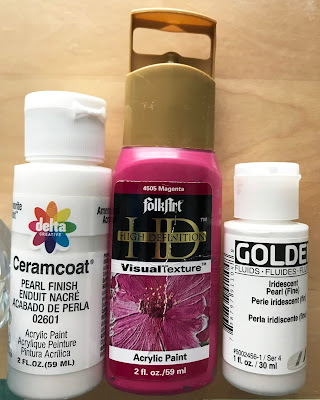
I started with these three colors and two pill bottle caps.
I spread some paint in a styrofoam plate and made paint rings on the background.
I had forgotten that the Dylusions sprays are not color fast and
my paint rings turned pink.
No bueno.
(If they had been teal I would probably have
been ok with that.)
I needed to lock in that color so I could still work wet.
No photo for this, but I pulled out my handy dandy can of
Workable Fixative and sprayed it all over the paper.
Then because the fumes about knocked me out,
we left and went out for breakfast!
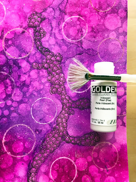
When we got home I took a Golden Fluid Acrylic
and mixed it with water on my craft mat.
With a splatter brush, I just flicked that
awesome iridescent pearl
all over the paper.
And my computer screen
and window
and glass desktop.
But, I was starting to like this a bit more.
Still too dark, though.
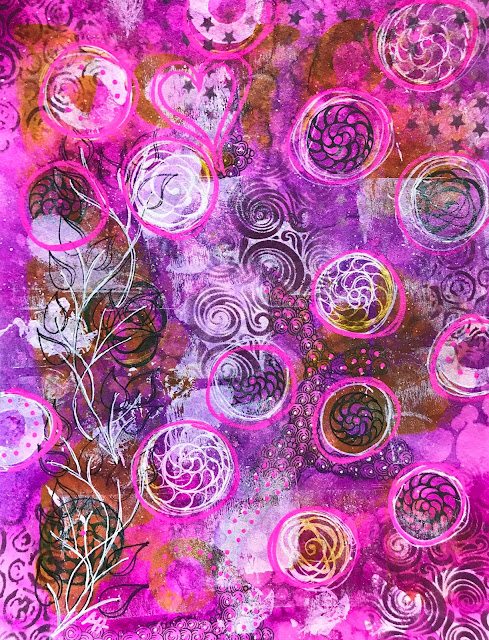
Somewhere along the way I started adding some
string roses and spiral roses in black and white,
then I remembered I was working on mixed media paper so I could
stray away and add more product.
That white is courtesy of a Uni-ball Signo gel pen.
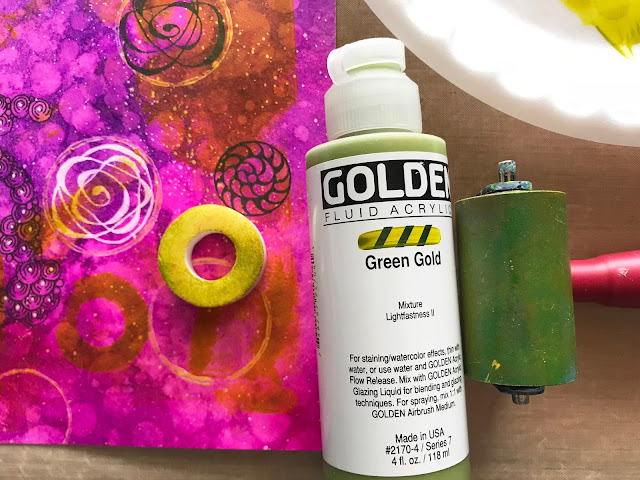
I love this green gold color and my skinny little brayer!
A little acrylic on a plate, mush it around with a brayer,
then layer some here and there over the paper.
Easy peasy!
Hey, wait! What was that white thingy in my desk drawer?
The spindle protector on a DVD stack that I had saved!
Makes an awesome stamp tapped into some color to add
a couple highlight rings.
Hahaha!
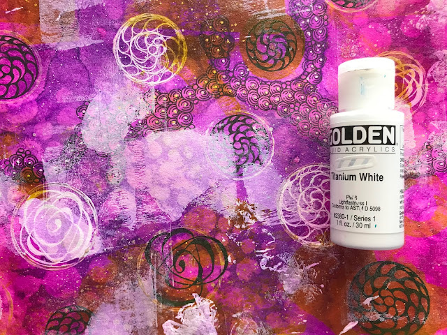
Titanium white to the rescue.
Brayer here.
Brayer there.
Voila! Not so dark everywhere.
Just a nice even contrast and balance.
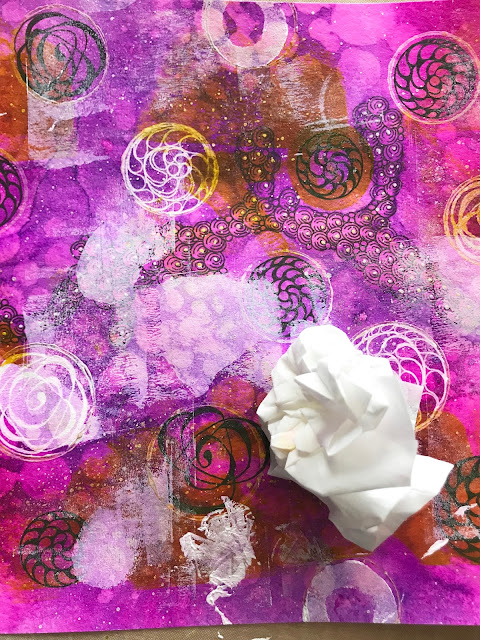
But there was still a decent amount of darkness,
so I took a Kleenex because it was close by
and dabbed it into the excess white on my plate.
Makes such great texture on my page!
Might as well use that styrofoam ring some more, too!
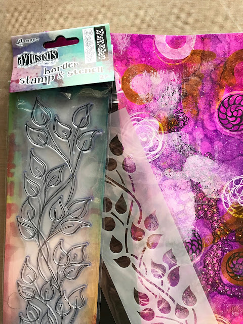
I don't believe this stamp and stencil set from Ranger is new,
but it is new to me.
My original thought was to stamp in black about half way up the line of leaves, then use a white pen to trace the top half using the stencil.
Nice plan, too bad I forgot.
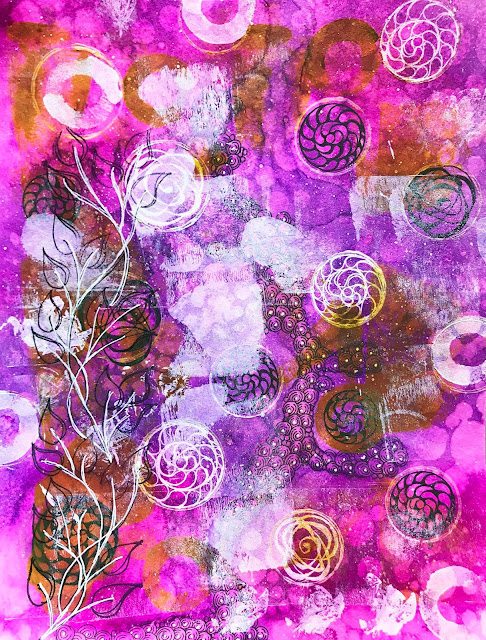
So I used the white pen to go over the vines.
OK, that worked great to alleviate some of that darkness.
I just felt like the page was missing something
to tie it all together.
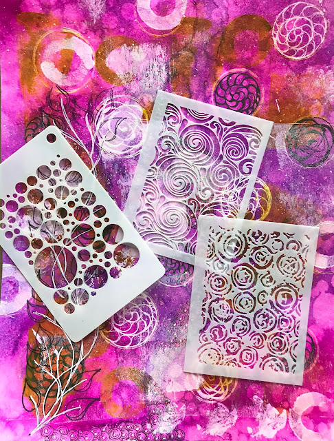
So out came some Itty Bitty ATC Stencils
from Joggles.
Something to keep the "flow" going.
So what did I do?
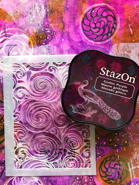
I added some of the dark back in via my
Gothic Purple StazOn ink pad.
I used a finger dabber sponge and pounced
the color through the stencil.
Through three stencils actually.
At this point I guess I forgot to take photos.
I also used a couple Sharpie paint pens to
highlight the rings, and to add dimension.
Some of my previous tangles were so obliterated,
I wanted to pull parts of a few back out.
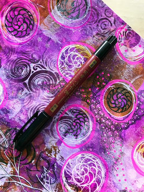
Enter the Zensations Brush Pen from Zebra Pen.
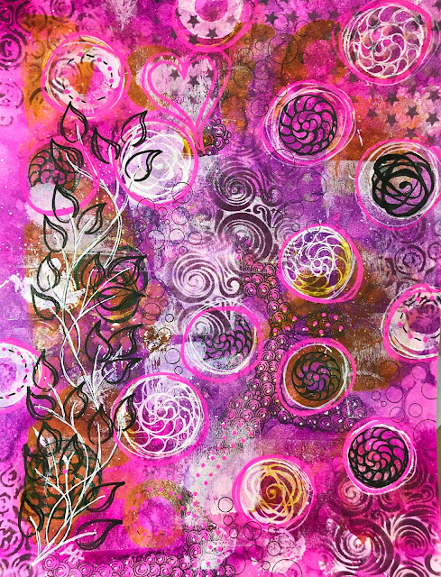
I traced back over the leaves and some of the roses.
I used the white Uni-Ball Signo pen to retrace some of the white roses.
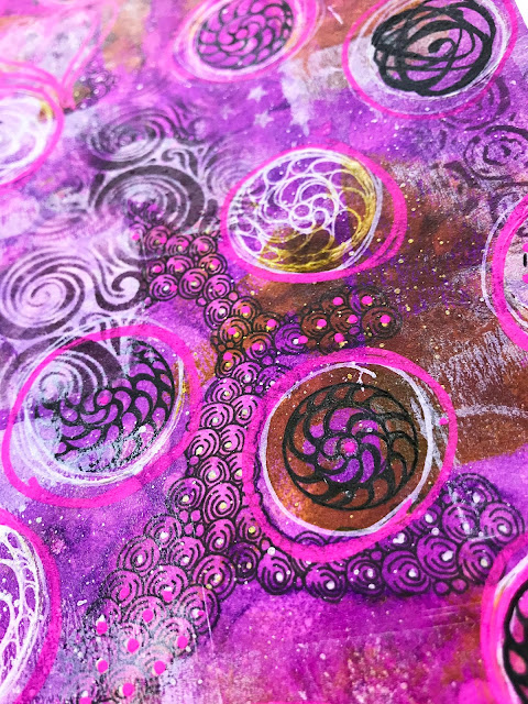
A closer view.
I felt like I was finished,
but I really thought that one string rose
to the right was too dark now.
That brush pen worked a little too well.
Hahaha!
So I pulled my splatter brush back out,
and watered down some pearl and some copper
and flecked bits of color all across the page.
Especially over that one black string rose.
And (again. sigh) said computer screen,
desktop and this time my cell phone.
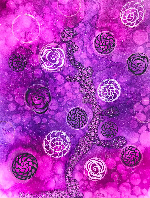
But at least I love this now.
And those other things are cleaned up
and back to new!
So, what do I think about the
Bamboo Mixed Media paper from
for my kind of mixed media mayhem?
I love it!
Everything worked great and no matter how much product I added -
and I added a bunch -
the paper stayed flat (even out of the pad)
and held up great!
When I read that it was j u s t 125 pounds,
I wasn't sure what to expect.
I normally work on 140 pounds and higher
and have lots of warping.
And curling.
I've learned how to flatten it back out.
Mostly.
But why waste that time if I don't have to?
I could be painting something else.
The Bamboo stayed flat.
It took at least 21 layers of paint,
spray ink, pens, acrylics, stamp pads,
and it came out looking fantastic!
The paper has a little texture to it,
not as bumpy as cold press watercolor paper,
but also not smooth like hot press paper.
That little bit of texture helped the colors puddle
and mix in the first step.
No problems with my pen work.
Everything worked awesomely and
I could not be happier!!!
Thank you, Carol, and Hahnemühle
for entrusting me with your product!
You pretty much rock!
If you are new to my blog, here is an important
piece of information.
PINK = link.


Oh, you had me chuckling away....... hope Aurora escaped the paint splatters if she was assisting. How you kept track of what you did & the number of layers, never mind your wonderful write-up is beyond me. This takes some experience to pull off, think I'd panic rather but then again I never did make friends terribly well with the haphazard nature of ink mopping with paper technique, invariably ending up with a pile of messy paper in the bin.
ReplyDeletehahaha! maybe next time I will include a photo of the trash can :)
Delete