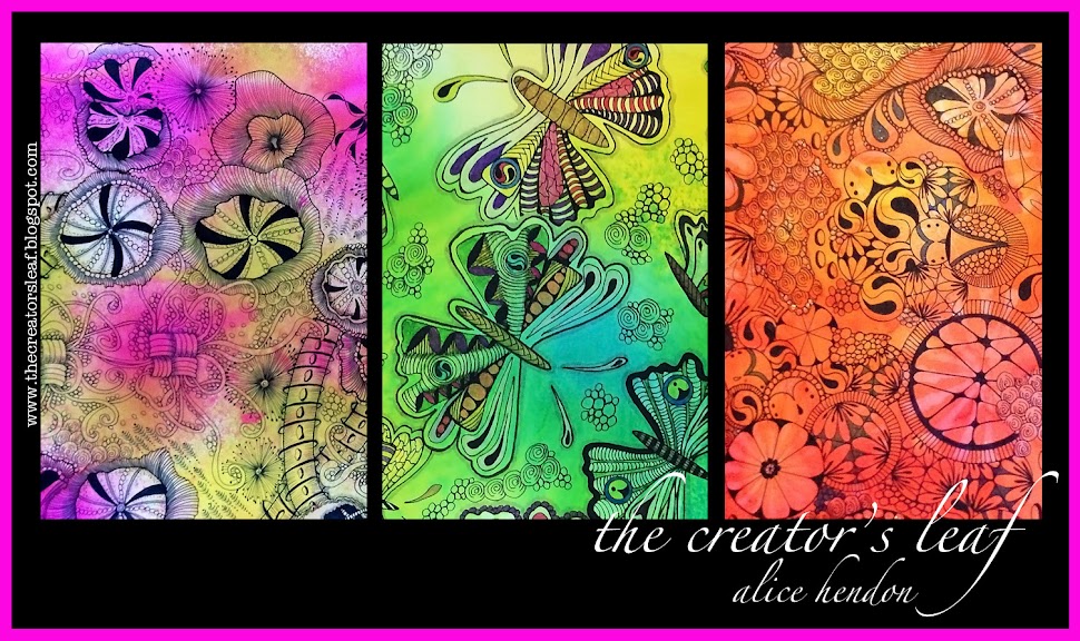
Splashin' Some Color
I've been trying to revamp my blog the past couple days. It's like expecting a car to be able to sing and dance. Or like thinking you can teach a cat to quote Shakespeare on a motorboat on the Nile. Not good. I got so frustrated, and wasted so many tiles, I decided to stop and play. You can see above what I made in about 5-10 minutes.
I made two tiles before I thought to photograph them. Before I started painting, I put my craft sheet on my desktop. I got mine at Michael's for about $3.00 on sale. An Inksentials Craft Sheet. That's the brown tweed looking sheet you see above. It's plastic and wipes clean (pretty much) with a baby wipe afterwards.
For the tiles above, and the ones in this set, I used Adirondack Color Wash that Tim Holtz uses. I started by washing a good layer of clear, clean water on the tile. Then I used butterscotch color wash - spritzing it on the right hand side of the tile. Then I spritzed some sunset orange on the left. I learned that I need to test this out before I blast a heavy shot on my tile - like you see above. All that came from one push of the button.
I blotted some of the color away with a paper towel, then added some purple twilight and wild plum on top of what was left behind. Because of the amount of water still on the tile, the colors will run and bleed together giving you the pretty colors you see above.
Definitely more color than I need since I want to tangle some designs on these tiles. So I should have remembered what I wanted to use the tiles for before I got trigger-happy with my color wash :), but never fear - this tile will go great on an art journal page!
For this tile, I used the color wash sprays in a different way. I left the tile dry, and spritzed some color wash all around the tile. I used at least four colors and a light hand. Then I took my wet paint brush and dropped some splotches of water on various parts of the tile, allowing the paint to run.
I had a little bit too much water here . . .
. . . so I wicked away the big blotches by lightly touching them with the paper towel. (Just so you know, I get my nails done at Davi Nails at Wal-Mart.)
And this is what I ended up with. Probably another art journal entry :).
For this tile, I dropped bits of water here and there on the tile, then sprayed on some cherry blossom walnut ink spray by Tsukinek, as well as some lilac. I thought it was entirely too dark, so I . . .
. . . blotted it with yet another paper towel. This time I placed the paper towel right down on top of the entire tile - which picks up excess color, but also leaves a cool textured design in the remaining color.
Those of you who know me, know that I am all about the color. At times (like now) I actually have this shade of pink mixed in with my brown and blonde hair. To get this color on the tile, I sprayed some raspberry Inkadinkado spray ink right on top of the tile you see above it.
(An aside note here - I do not like the Inkadinkado spray inks! It is next to impossible to control the amount of ink that comes out, and when you press the spray button - ink shoots out onto your fingers. This has happened with every bottle of Inkadinkado spray ink that I have tried. I was hoping this one time it wouldn't happen. Oh well. )
I dripped a little water on top of the color and pushed the color around a bit with my heat gun. Works pretty well for pushing, and you get some nice colors as it dries.
I wanted it to have some contrasting color, so I took a few swipes across the tile with a broken china Tim Holtz distress stain.
I just noticed I have the wrong bottle of color showing with this tile. Oops!
Speaking of Tim Holtz distress stain - new tile! You can see that I just splashed some drops of water onto the paper. I didn't want full coverage. I wanted to see what would happen with just a few drops. Then I used the dried marigold stain and just tapped it onto the tile in a couple places. I was surprised by how much color came out and by the intensity. I like it!
So I added some more colors - spun sugar (my favorite), dusty concord, and broken china (the blue) - staying with the tapping.
There was too much water, so I blotted the whole thing with a paper towel. Then it was too light.
But my paper towel looked awesome!
The only thing I did was to tap back on a little orange (dried marigold) and I was done with this tile.
So there you have it. The 5-minute-Alice-Hendon-teaches-a-cat to quote Shakespeare on a motorboat on the Nile technique. I hope you enjoyed it! You just learned how to do it right along with me, cause there's a first time for everything :).


wow
ReplyDeletelove it!
lucky you...you have supplies ;)
thank you, fifi, we are blessed. i am glad you can at least enjoy it through pictures.
DeleteThese are wonderful! I love all the fabulous colors. Traci Bautista uses the paper towels in her art journaling. Nothing goes to waste. You can also use a scrap of paper under your tiles instead of your craft sheet and later use that paper for a collage or art journal. Thanks for sharing I need to go buy some of those wonderful colors.
ReplyDeletethanks for stopping by, janet! i've seen traci save the paper towels, i just didn't think about it. that's a great idea about the paper under the tiles to catch that color and use it, too - i will definitely be trying that out - probably later today :) thanks!
DeleteThat was so much fun to read and view!! I love what I like to call the "color commentary": where you get your nails done, the hair reference. I will definitely be trying this! Been having a rough few days and I gotta tell you I got a ton of smiles and chuckles from this post!
ReplyDeleteThanks so much!
Sue
i'm so glad i brightened your day! and now i'm praying for some better/easier days for you this week! let me know how this works when you try it out - i'd love to see your results :)
DeleteGreat fun! This type of thing is the only thing I have learned to be really loose with so far--LOL! Love it! :)
ReplyDeletei could do this all day - so much fun! thanks for stopping by :)
DeleteGreat techniques to make backgrounds for Zentangle-inspired art!
ReplyDeleteand so much fun! thank you for stopping by!
DeleteLove the new header. Had to smile for I started to read & wondered about Distress Stains (I have those) & there you were using those....... Chuckled over your hair......... hmmm my almost 52 years old mop is a mixture of aged Strawberry blonde, ashen mousey blonde with hints of ginger plus streaks of grey bordering on white.
ReplyDeletePaula (PEP)
haha! so is my almost 60 year old, paula! almost totally white on the right side, still brown in the back, and mostly gray on the left - haha! so i just switched it all up for other colors :)
Deleteglad i could share some ways to play with your distress stains - they are really versatile :)
Brilliant! I love new toys!! This looked like a lot of fun to play with--will definitely have to check them out on the next trip to Michaels (which is scheduled for later this morning--LOL)
ReplyDeletethanks, dawn, we're headed to michael's later today, too. need some bristol paper :)
Delete