If you have followed my art for awhile you will already know that my hands-down, go-to art supply is Dylusions Ink Sprays. I love the bright, vibrant colors they give and they are so much fun to play work with. You just can't go wrong as they never fail to deliver.
There is a group on facebook called The Dylusions Facebook Challenge. It is a group for those of us who love Dylusions and each month (this was the second) they issue a challenge. I am only 3 days late. This is my response to October's challenge . . .
. . . to use colors lime and orange, and mushrooms. I went to my Strathmore mixed media journal and set up a couple sheets of scrap paper to catch overspray. I used a flat brush and spread water onto both pages, then spritzed spots of fresh lime and squeezed orange onto the two pages. If you haven't used dylusions before - you will find by wetting the pages first, then spraying the color onto the wet areas, the colors will bleed and blend and mix and wow! In the photo above it looks like I used a yellow ink but I did not. I only used the one shade of lime and the one shade of orange.
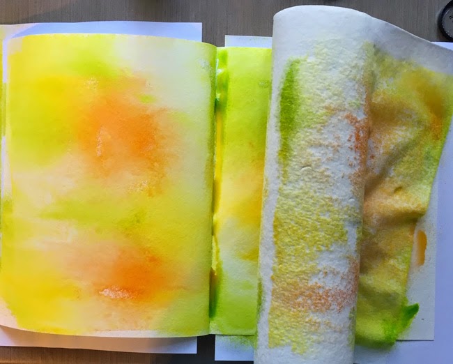
Don't worry about those puddles in the seam of the pages. Those are easily blotted up with some paper towels and they provide texture to your finished product. I also roll the towels across the pages to pick up excess color and water. It softens and smooths out the colors. (Wow! I can see a couple fingernail indentions on the roll. I was using Viva towels - I will never get this brand again. It is so hard to pull the towels apart and rip off the one you want to use.)
Voila! Completed color!
OK, maybe not. How about some drips? I spritzed a little more color, then I held the pages at an angle to let the drips run towards the center of the book.
I wanted even more drips, so I dipped my paintbrush into a bowl of water and dropped splotches of water onto the outer edge of the page and held the page up so the drips would run. You can see a puddle of color building in that center seam. Just blot it with a towel. I dried both pages with a heat gun.
Let's talk ghosting. This is an easy-peasy way to add texture to a page. Take a stencil - this was a new one from Hero Arts - and hold it down where you want some texture. Spritz water over the top of the stencil and wait about 10 seconds.
Lift the stencil away, wait about 10-15 seconds longer, then blot with a paper towel. You can finish drying with a heat gun. Because dylusions ink sprays are not water-fast, when you add water through the stencil the colors starts lifting away. When you are finished with this process and the page is dry - you get the ghosted images you see above and in the next photo.
Pretty spiffy. (And I have no idea why this page looks so dark. Sorry.)
I did this on both pages.
Layering is a really fun thing to do with your art journal pages. Here I used a Dylusions stamp and stamped some leaves along one edge.
By off-setting the stamp, I was able to get the illusion of varying heights of leaves.
There are some of those mushrooms and a cute little arrow - more Dylusions stamps. (Part of the challenge is to use as many Dylusions products as you can. Yes, it is a money-making venture but since I already have a ton of Dylusions stuff it works for me :). )
Also, you may notice where I didn't do a very good job stamping and missed some of the lines in those mushrooms on the left. 1) I knew I was going to be placing another element over that area so I didn't worry about it. 2) it is a simple fix to draw those few lines back in with a micron.
A lot of people ask me what kind of pens/ink I use to prevent smearing when I add wet product over black ink. For these pages I used black staz-on in an ink pad, but that is not the only way. I print a lot of pieces out on my ink-jet printer that I copic over, and I am stamping more and more. Anytime you use black ink - set it with a heat gun. I have never had any problem with smearing once I heat set the black lines. You should always try this on scrap first before you - heaven help us - ruin that one piece you don't want to remake.
OK, my two-page spread is complete in its first couple of layers. I stamped other images onto cardstock to be used as additional elements. You can see a little of those at the top of the photo.
I colored all the pieces using Pitt Artist Pens, then cut them out. I figured my placement on the pages before I started attaching. (I originally wanted to make her face blue but didn't have a good face blue - hehehehe - so I went with green. Channeling a little Elphaba here maybe.)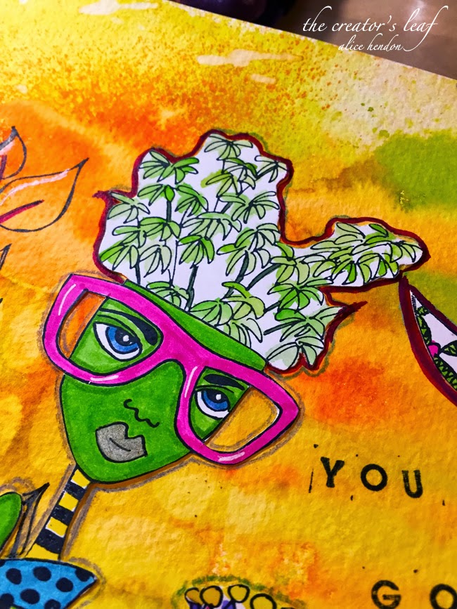
There are some little glimpses into the elements I used.
Left page.
Right page.
Hahahaha! So much fun! Next month's challenge is to use red, black, and your favorite Dylusions stamp. Hmmm. I'm thinking the Red Queen. Such a Once Upon a Time fan! Hahahaha!
Linking up to the Artist's Play Room.
Here's another piece of art I worked on at Kali's - prior to moving her back south. Almost like a mandala, but missing the precision of a mandala. I started with that radiating spiral in the middle and just kept adding.
It has taken me probably close to five minutes to find my chop - signature - in there. I try to always include it in every work I draw - or paint. Can you find it? My initials A and H, with a leaf - for the blog title: The Creator's Leaf.
I'm still trying to catch up here at home. So many things that need to be done and only so much energy. I'd rather sit in my chair and draw than clean house any day. Nothing new there. Ha!
Thanks to Debbie Nolan for following The Creator's Leaf this week! Welcome!
Linking up to Artist's Play Room this week. You can check it out here.

Got my journal cut out and sewn together today. And looking at this photo, I see that I need to take it apart and resew it. This time in the correct order. That would be a tail you see right behind that cover. It is supposed to be a place for a mermaid face to peek out. Oops! But I am going to post these photos anyway. Cause I already took them :).
A closer look at the pages.
This seahorse is one of my favorite parts so far. And the glimmery, shimmery, oceany look in these paints. Studio acrylics from PeBeo, the iridescent colors. I actually used a gold, a teal, and a green on this page and scraped them across with an old Disney World room key card.
Here is the reverse side of that seahorse page. You can see (almost) the full mermaid here. Or at least what will be a mermaid when I get to that part of the class.
Hopefully this octopus will make some awesome hair for one mermaid. I have to tell you I've never done anything like this journal before. I have done a couple of Jane's classes (not Teesha's) and Jane really explains things well, so I have great expectations for my little mermaid circus book!
Linking up to the Artist's Play Room today. You can check it out here.
Today's post is going to be short. And to the point. My left wrist is killing me. Lots of pain around the bottom joint of the thumb. I have my hand in a brace and from experience I know the pain should subside by tomorrow. Starting to think I need this looked at by a doctor.
Anyway, on the facebook group Square One: Purely Zentangle® where we are challenged to get back to the basics in zentangle, the prompt this week was bronx cheer. That would be all those little blackberry looking bits above. Maria Thomas came up with this tangle as a way to cover up mistake areas, blotched areas in our drawings. Our prompt here was simply to make the bronx cheer part of the drawing. I left the stems off and buried them within the printemps. Added a little waving flux and some beadlines and am calling it done.
Linking up to the Artist's Play Room for the week. There is a whole week's worth of time for you to add some art of your own!
It has been a bit of a rough week for me. (You know, I think yesterday's post started with almost identical words. Sorry. I do know more. Honest.) So. A bit rough. I won't go into it here. Suffice it to say the week took a lot out of me.
You ever have a week where you just don't want to get out of bed? For any reason at all. That's still me. No motivation. At all. So I am making myself go through the routine. Making myself stay busy.
I started this drawing a week or so ago. I don't really even remember where I was. Maybe at Kali's. Anyway, I pulled it out last night and shaded parts of it. This morning as I look at it - on this day of worship - I immediately saw a basket at the lower left corner. So not planned. A basket with lots of lovely, fun, hopeful things bursting forth from it. Joy, frivolity (is that spelled right? no little red, sguiggly line so it must be), happiness, playfulness. And I think - why not? This week will be what I make it.
So. I decide right now to make this week a better one than last week. I decide right now to be happy, to be satisfied with my life as it is. But I also decide to strive towards what God has planned for me - and I know that He wants me to be fulfilled and to be serving (cause that's who I am. I am fulfilled when I am serving.)
How will you live your week? How do you decide - right now - to make this coming week even better than this past one?
(I am linking up to the Artist's Play Room this week. Check it out here.)
Some time back, my friend Sandy Hunter did some experimenting with taking two tangle patterns and turning them into one. Kind of a mash-up, if you will. Last night I was drawing Michele Beauchamp's blooming-butter and thought it would really mix it up well with the TootsieMoon that I've been working on.
This is a drawing of blooming-butter that I posted a couple months ago.
And here is the step-out for TootsieMoon. I took those arms of the blooming-butter flowers and turned those into arms of TootsieMoon. What shall I call it? I think I'll call this drawing . . . TootsieButter!
Linking up to the Artist's Play Room.
You might be thinking, "hmmmm, that's a strange name for a post!" Or perhaps you didn't even read the post title, but you just looked at it after reading that first sentence. Hahaha! Last night I posted the above picture on my facebook page The Creator's Leaf and said that I was working on something new.
I continued working on this piece as the night got later and later. Working in my 7" square Stillman & Birn Zeta Series sketchbook always makes me happy! Perfect paper for tangling on! (And for adding a little color later on!)
As I continued drawing, this is what came out of my pen. Circle upon circle upon circle. And I just kept adding little bumps here and there, and auraing them, and moving on. I know this is similar to other tangles, but I haven't seen it drawn quite like this. As I looked at the piece, it kept reminding me of one particular thing. Hence, the first part of the name. (Could you tell I was hungry?)
Then I started auraing the sections within the primary circle, like you would with crescent moon. And when you combine the two things - you get tootsiemoon - and that would be where the post title came from! Step-outs to follow soon, along with some more examples.
For now though, I want to link up to Artist's Play Room for their weekly artsy challenge. Click on Jenn's link and go check out what everyone is doing this week. You can even link up to your own art so the rest of us can enjoy what you're learning!

Underwater steampunk? That was my husband's comment when he saw this piece in progress - that it looked like underwater steampunk. How did I come to this end result? So glad you asked.
I must apologize because I totally forgot to take a photo of the before page. Recently I came across an excellent sale on Twinkling H2Os and had to order several colors I didn't already have. Cause you know you have to do that when there is such an awesome sale! It's one of those unwritten art journaling rules. Anyhoo, when I unpacked my order, I pulled out my favorite Strathmore Watercolor Journal and tried out all the new colors.

Just in case you've not used H2Os before - let me give you a tip. Consider it a bonus in this post. About 10-15 minutes before you want to use the colors (or even longer if you can be patient) take the tops off the jars and spritz in some water. I use a pipette and put 3-4 drops of water into each pot. Then I have this lovely little bottle of Ox Gall liquid (don't even ask) from Holbein. I add 1-2 drops of ox gall into each pot. Then let them sit. The mica and the pigments have to have time to hydrate, otherwise you will only pick up color from the top of the pot. It will not have all those lovely little bits of mica which is really the part that makes the H2Os twinkle. The ox gall speeds along the process, enhances the flow of the H2Os, and just makes your painting all around more awesome!

Once my lovely little pots of bold, shiny color were hydrated I used a paintbrush to stir them up. When you have a wonderful thick syrupy goo the H2Os are good to go. I used a watercolor page to test the colors. This is what I used for the base to build my drawing on. As you can see I really had no design in mind, I just started laying in bits and pieces of tangles to flow with the colors. See how those coral pipes flow along the lines of the pink and red? And the printemps (clams?) fill in blocks of pink and yellow?
I truly had no end goal in mind. I just kept adding cool tangles until I felt like the drawing was finished. Someone commented recently that they struggled with leaving white space, with feeling like they had to fill in the entire area with design. Sometimes I do that like in this post (OK, disregard that statement, I haven't posted that picture yet. Oops!) and sometimes I just stop when it feels right.

Then I struggled with the same dilemma I always struggle with - do I shade and highlight? I genuinely liked the way the whole thing looked and think it would have been fine left as it was. I didn't know how shading and highlighting would work on the H2Os. They tend to give you a slick feel which makes surface grabbing kind of tough. I started with a graphite pencil for shading, but quickly gave that up for a pale grey Pitt pen. I used my white General Chalk pencil for some highlights, but when I smudged with my white tortillion the highlights all but wiped away. So most of the highlighting you see came from a white gelly roll pen. I do like the difference the shading and highlighting made - even though it was a stretch to make it work.
* * * One important last note about the H2Os - and this is critical - don't put the lids back on until every bit of that lovely little paint is absolutely dry! If you put the lid on wet paint it will dry shut and you won't be able to open this jar again without breaking the lid. Not cool! I have this on good authority - not based on experience. * * *
Hahaha! Thank you for reading to the end of this crazy post. I loved making this piece of art! You know me - - - bright, vivid, and colorful are my middle names! Have I shown you my hair recently? Just re-blued last week - thank you, Brittany!!!
I am also going to use this for my Artist's Play Room post once Jenn sets up this week's link. Click below to see some amazing art!