I first heard about Peerless Watercolors in an online class I am taking taught by Artomologist Jane Davenport. They are these really nifty little sheets of paper of highly concentrated pure, intense color. The description from the Peerless page includes words like intense strength, absolute solubility, clean color, and convenient. The color adheres to one side of a specially designed paper fabric. The color is activated when water - or any other soluble mixture - is applied.
What you get with Peerless is plenty of bright, vivid, beautiful colors. Which if you know me, or follow this blog, you already know I am all about the color! I took my Peerless swatches of color and made a color chart page spread in my color journal. I used a Tim Holtz Ranger waterbrush and just touched the wet tip of the brush to a Peerless sheet, then brushed it onto the page. Seriously, it is that simple!
For this particular project I worked in my Strathmore 8" x 5.5" watercolor journal. I just started picking up various colors and touched the wet brush to them, dragging color across the page.
I kept adding color - building my page. I used the colors I thought I would be coloring with the most. I'm not much of a brown, grey, or tan person so I pretty much stayed away from those colors. I just kept adding and building layers of color. Stacking them here and there.
I worked on this page at Cindy's home just outside of Toronto last month. One of the many things Cindy and her girls introduced me to was hot tea and milk. Yummy! In fact, I had to buy some tea bags as soon as I got back stateside!
Of course, it is a little bit harder to use your Peerless watercolor swatches when Mr. Socks is laying on top of the swatches and your book. Those little papers under Mr. Socks' front paw? Those are the swatches. If you look closely at the one on top of the stack to the left of the photo, you will see a small dot at the bottom corner and another at the top corner of the swatch. That is where I touched my waterbrush to the swatch to pick up the color. These little sheets are going to last me a long time!
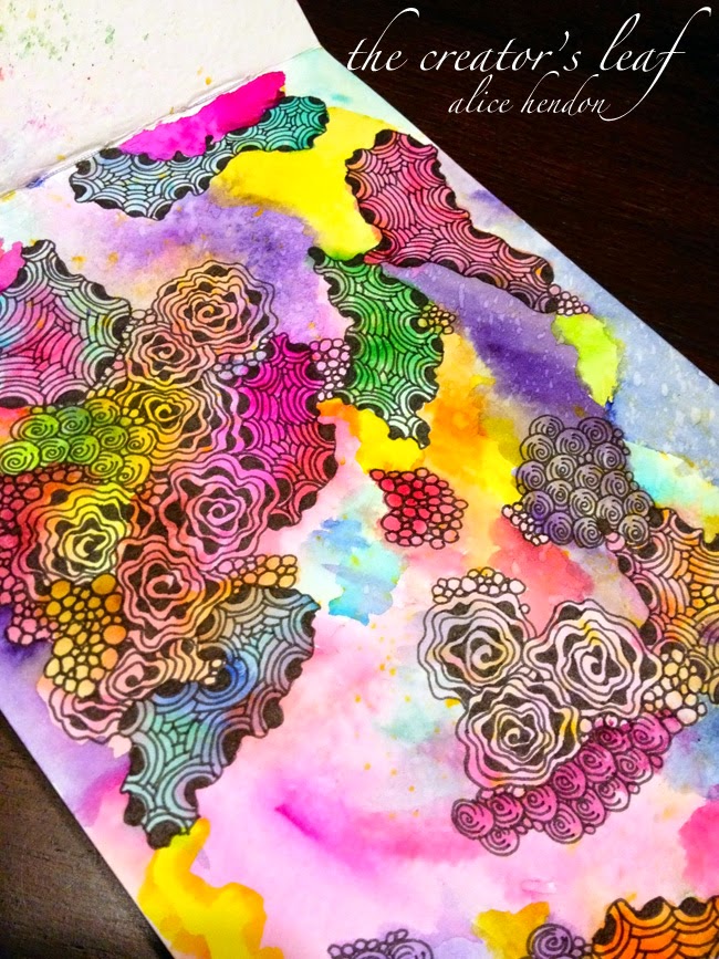
I just kept working till my page was filled with awesome, gorgeous, wild color! Above is a close-up.
Here is the whole page. I really just started playing with ideas and this is what I did to get that speckled look across the top. See those random white splotches?
I have no idea in the world why it worked this way. I placed a swatch of dark color next to the right-hand side of the journal. Then, using my waterbrush I flicked water at the swatch - angled from right to left. Think spattering. As I flicked at an angle, the water spray hit the swatch and bounced across the surface of the journal making these lighter spots where it lifted color from the page. Pretty cool!
I was satisfied at this point, so I pulled out my Sharpie fine point pen and started adding tangles. I love working on a larger scale piece and adding tangles to match the size of the color blocks. Tangle with the flow of the color, so to speak.
I just let each section run into the next, using those four tangles only.
Keep in mind that open space - also called white space - is good. You do not have to fill in every bit of space. Unless you want to.
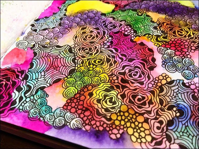
So much fun to do. You can see the variation in colors of the Peerless watercolors and see how they blend and flow into each other. There is a section in the picture above that I just love. In the lower left corner you see a pink rose shape - that's the diva dance rock n' roll tangle. Just above it you see a section of little black crescents with lines arcing in towards the middle (crescent moon.) It's in shades of teal and pink. That's it. I love the way those colors work together!
Such beautiful color and you can hardly even tell I used my Peerless swatches!
And even though this page may look difficult, it was super easy to draw. Thanks to the power punch of Peerless watercolors, a Ranger waterbrush, and some simple tangles! My perspective on Peerless? Worth every cent and then some! You just can not go wrong!