For a year now I have been seeing all the beautiful
distress ink backgrounds on Facebook.
I decided it was a time to give it a try.
I still have a long way to go,
but here is what I did.
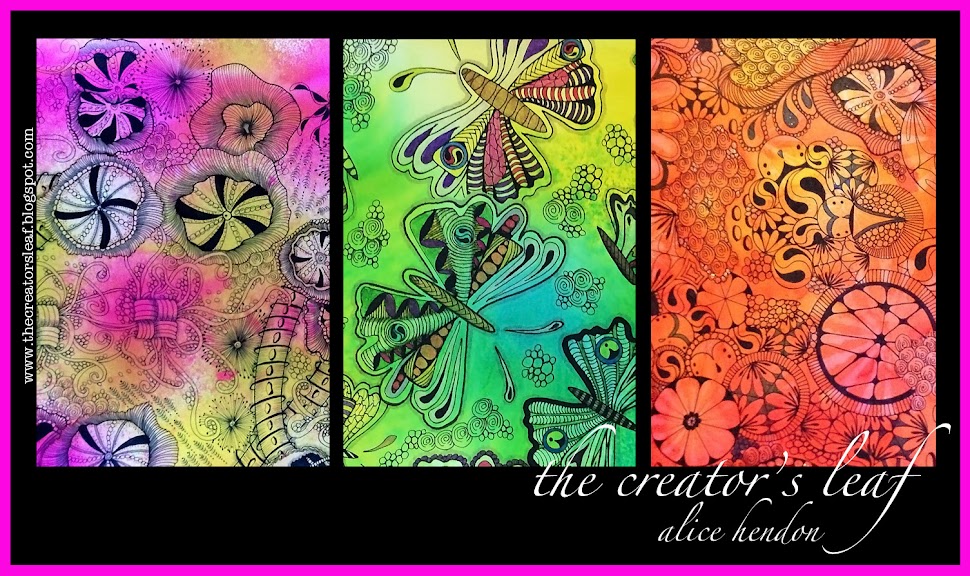
(The colors in this first photo are more true
to the actual colors than what you see in the
photos below. I have no idea why. Sorry.)
Supplies are minimal.
Ranger carries a line of
Tim Holtz Distress Ink pads,
and the blending tool to spread them with.
Both are inexpensive and you can get them
at pretty much any craft store.
Mine came from Michael's.
I used some sheets of 4" x 6" paper
that I already had cut.
Hot pressed mixed media paper - I think.
For the first piece, I just pulled the ink pads
across the surface of the paper.
Rubbed them back and forth.
I didn't like the white splotchy areas.
At all.
This time I used the blending tool.
Seriously, it is as simple as dabbing the
tool onto the ink pad and picking up the color.
Then I just rubbed it in circles on the paper.
I concentrated on full coverage -
no white splotchies -
and tried to blend the colors into each other.
I liked this one much better!
So I just kept on trying that technique.
Circular motion, rubbing the color gently into
the paper, and blend the edges.
This one worked much better,
though I like the colors in the one before it more.
I think I got better at blending as I
went along. A lot of success in blending
depends on the colors you choose.
For this one I have something specific in mind.
And I think the colors are wonderful!
Yes, I still have lots to learn about using
distress inks, and I am going to keep on
working at it!
Then I am going to tangle on a bunch of them!