Sunday, September 30, 2012

One Last Project

I had one last project for this week. Twinkling H2O's. I got a bunch of new colors for my birthday and was just itching to try them out! I started by spritzing some water into the tubs to get the colors primed and ready.
I used an 8" x 10" piece of watercolor paper and wet the entire surface really well. Then I used my twinkling H2O's to lay down various colors with a brush. To get some pops of color, I dropped spots of color in random places. 
As I let the colors start bleeding, I started to see some feathering.
Not as much bleeding and mixing as I wanted, so I sprayed a layer of water across the entire page. This caused the intensity of the colors to soften.
As I let the paper sit for a few minutes, the colors started spreading out more, overlapping, blending and merging. 
To get the color pushing a little more, I spritzed this with some rubbing alcohol. As soon as it hit the colors, I started getting more spread patterns, more color, and more variation.
The alcohol kept the colors spreading and fanning out.
I love the intensity of the colors and the way they bleed together. Starting to pick up a little sparkle in this photo.
More detail of a different area.
And more. That right-hand corner didn't get hit with the rubbing alcohol and those colors blended in a different way.
It was a productive day. This is a shot of some of the supplies I used overall. Add in the twinkling H2O's, sharpies, a couple more tile and it was a good day! Now to decide what to do with all my projects!

The Creator's Leaf

Saturday, September 29, 2012

Using New Product

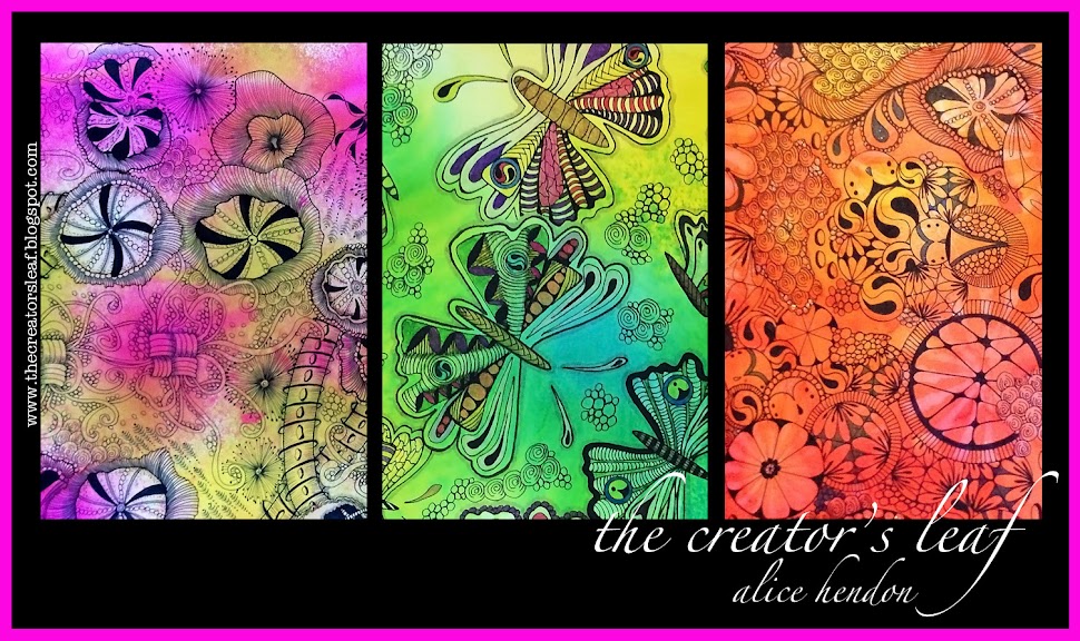
This week I've been in a painting mood, playing with paint - not painting a portrait or a landscape. Just seeing what different products do when you mix them. Above you see my finished tile.
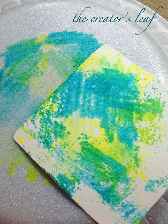
I began with a zentangle® zendala tile and spritzed two splashes of color onto the tile. I used Donna Salazar's Smooch Spritz - ink in a spritzer bottle, color Seabreeze.
It was a whole lot darker than I wanted it to be, but not as dark as I expected just looking at the color in the bottle above.
I wanted to lighten up the dark blue, so I started by spraying some Fresh Lime Dylusions ink spray across the top of the tile. I sprayed a direct hit on the higher blue splotch and it lightened considerably. I  liked the contrast, so I left the darker blue spot alone.
I like the Dylusion line of ink sprays a lot and have several of them. They are easy to use. Some other sprays are hard to pump and control the amount of ink that comes out - and the Dylusions sprays don't leak on your hands - yay!!! Because that seabreeze smooch spritz left my hands in a big mess! Here it is three days later and I still have blue on my right hand. Sorry to ramble . . .
The last thing I did was to spray rubbing alcohol across the top of the entire tile. Then I let it sit while we went out for supper. By the time I got home several hours later, the tile was dry. I really like how the colors blended into one another. I can see blue, and several shades of greens and yellows. I don't know where those pink spots at the bottom came from. Probably off my craft mat from one of the other projects. But, my point is - I only used two products of color to make this tile.
 I made another project on a zendala tile from Zentangle®. To make this tile, this is what I did:
I sprayed some Tea Party Smooch Spritz from Donna's line several times across the tile. 
You may notice I was getting paint and spray inks all over my desk top. You might already know about this product, but in case you don't let me introduce you to Tim Holtz' amazing craft mats.
It is 15" x 18" and virtually impermeable. (Spell check is telling me that is spelled correctly, maybe it is, doesn't look like it to me, though! Anyhoo!) This craft mat is so wonderful I went back and bought a second one. I cover my work top with these mats and spray away to my heart's content. Where you see color on the mats - notice it beads up and stands above the mat. I just wipe it off with a paper towel and I'm good to go.

For the next step, I used Sunset OrangeAdirondack Color Wash on top of the previous color, to fill it in a little more. To get the colors moving a bit I spritzed some water over the tile. Unfortunately I did not get a photo of that step.
Then I took some Cherry Blossom Walnut Ink (Tsukinek - I love this stuff!) and tried to spritz some on. Came out a little heavy handed, so I sprayed some rubbing alcohol over the top, which toned down the heaviness a little.
The rubbing alcohol made the colors spread, so I gave it a few minutes to let it work.
 After the colors stopped spreading, this is what I had. I still wanted a little more purple, so I sprayed on some Wild Plum Color Wash and loved the way it looked. This is a good time to tilt your tile and let the color move around some .
I was really starting to like how the tile was looking, but it still needed a little oomph! You can see on that lower right section I sprayed some Sailboat Blue Color Wash. Actually quite a bit. And I let it sit again for about a minute to let some of the colors blend.
Another spray of water, a little blotting with a paper towel, and I was to this point.
I left it to dry over night and this is how it looked the next morning. I really like the colors and the way they blended into each other. I used a total of five colors on this tile. The water and alcohol used at different steps in the journey helped the colors to mix and blend. What an easy project - I can't wait to tangle something on here!

And I saved all those paper towels with color all over them. Does anyone know what I'm supposed to do with them? Someone told me I could use them in a journal, but I don't know how. That would be fun to know!


The Creator's Leaf

Friday, September 28, 2012

Salt and Watercolor Wash

just add water silly's blog hop link
This week in the Artist's Play Room, our challenge was to try out something we had been wanting to do! Recently on the CZT facebook page, I watched a youtube video about using kosher salt on a watercolor wash as a different technique. I watched several videos on this technique and everyone said you really needed to use kosher salt, that it just worked better. So, off to Wal-Mart I went. This afternoon I took a 5"x7" piece of watercolor paper, covered it in a generous layer of water, and started moving some color around. For this project I used a basic kids watercolor set from Michael's to push some color. I let it blend and run and start to set up, then sprinkled some kosher salt in a couple areas. I didn't cover the whole piece so that I could see the effects of the salt.
Not sure why, but as it dried the colors softened up. The picture above was taken after the piece had dried and I had brushed off the excess salt. I like the edges of color lines - I'm guessing they were caused by a reaction with the salt.
And because I'm such a messy painter, I had paint on the backside as well. Which works out fine because I can use this as a two-sided page in an art journal.

Here is the youtube video I watched to learn this technique. I did not paint my page in the bathroom, however.
I learned this technique on Pinterest. Pinterest is a great place to learn a hobby! That's where I learned about art journaling, and where I first heard of 'zentangle.' This blog began as a result of what I learned on pinterest. Anyway, here I took three different colored sharpies and scribbled them on the back of a styrofoam plate. I was supposed to use something hard plastic - non-porous. This worked alright, but something hard plastic would have worked better.
Next, I sprayed the color with a little rubbing alcohol which caused the color to bleed and blend a bit. Then I turned a zentangle tile over and laid it in the wet color, which allowed the tile to soak in the color.
I was able to color two tile with that little bit of sharpie. If you don't want to use sharpies, you can also use copics or alcohol inks. I expect they would probably work better - I just couldn't remember where I stashed my alcohol inks the last time I got "organized."

I tried at least three more watercolor/paint/ink techniques which I would like to share with you, but it is 1:00 AM now and I should really go to sleep. I need to get up early tomorrow to go have my hair re-pinked! Yay!!!!

Head on over to Jenn's page - Just Add Water Silly - which is where the Artist's Play Room is hosted. Check out all the blog posts and maybe even share one of your own!
The Creator's Leaf

Thursday, September 27, 2012

Divas and Strings

iamthedivaczt
Week number 88 with the Diva's Challenge - welcome to IX. My CZT class was the 9th one, roman numeral IX, hence the name IX. This pattern was introduced at our class and I have to say I don't like this pattern one bit. I just don't get it. I keep trying, but it is not my friend. You can see IX in the upper right section of my tile.
It is also time for string #19 at Tangle Patterns. The string was given by Linda Selymes. Above is my tile I drew to go with this string. This tile is posting for both the Diva's Challenge and Linda's string challenge at Tangle Patterns. Go check it out and while you're there, why don't you post some tiles of your own :).
The Creator's Leaf

Wednesday, September 26, 2012

Just a Little Practice

When I went to the CZT training last month, Maria and Rick gave each of us a wonderful bound journal to take notes in. Maria refers to these as field journals. I wish I had understood a little better how we would want to keep these and use them and refer back to them over and over and over. I would have written more legibly. I would have been more precise and deliberate with my sketches. Since I've been home I have taken time to work on some tangles in my journal, some that I had been having problems with. Here you can see that I traced a tile twice and worked on several patterns. I think I will continue this - as a quick reference/refresher - and continue labeling as I go. Just a little something I worked on a couple days ago. Where do you keep your notes? How do you recall the patterns and what they look like? If you are traveling and don't have easy access to the internet and Linda's tanglepatterns.com, this might be one answer.

The Creator's Leaf

Tuesday, September 25, 2012

Zendala Dare #24


It is hard to believe it's been 24 weeks since Erin started the Zendala Dare. I participated in her first dare. It was my 3rd post on this new blog. Since then I have gotten fully immersed in this art style called zentangle, to the point that last month I trained and became a certified zentangle teacher. For jollies, here is the zendala I drew for that first challenge.
I have learned a lot since then, but I still kind of like this zendala. Haha! Wow! I've learned a lot about editing since then, too.
Back to week #24, this is the template Erin gave us to work with. I didn't really know what I would do with it, nothing was coming to mind. So, I just picked up a pen and started with that center square. Then I moved on to the main square and dreamed up some borders.  I enjoyed trying out Helen's petal ribbon (a take-off of finery,) which you can see on her blog A Little Lime here. A really pretty and fun variation! From there, this tile just kind of took on a life of its own. Throw in some Pitt artist pens and Derwent Inktense Pencils, flick a little color around, and call it done.
Several people have asked how I take photos of my tiles for posting. My main problem is always finding even light. Look for a spot where you have the same amount of light across your tile - and background, if you use one. Be careful around windows because you will get some sunlight, some shadows, making your photo uneven. 

Every photo on my blog has been taken with my iphone 4S, even though I have an excellent canon, the iphone just takes good pictures. I get as close as I need to so that the tile and a minimal amount of the background fill up the screen on my phone. I lean against my chair, lock my arms to my side, hold my breath, watch for the square on the phone that tells me the shot is in focus, and gently push the button. No snapping, no jerking, no punch the button to get it over. Gently, so your photo is sharp. Then I just email the photo to myself for editing. And that will be the subject of a different post.

Head on over to Erin's page The Bright Owl and check out all the incredible zendalas! You should really draw one of your own and post it for us to enjoy :).